Color plays a powerful role in shaping the mood, function, and aesthetic of a home. When chosen intentionally, paint tones can enhance natural light, influence how spacious or cozy a room feels, and even support emotional well-being. In luxury homes—especially in coastal regions like Ponte Vedra Beach, FL—color choices are often guided not only by personal taste but also by the surrounding environment, architectural style, and desired lifestyle experience. Understanding the science of color and how it interacts with space can help homeowners create interiors that feel both sophisticated and welcoming.
Understanding Color Psychology
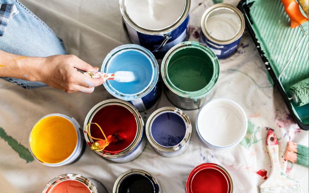
Color psychology is the study of how different hues influence human behavior and emotions. While reactions to color can be subjective and shaped by personal experience, certain tones tend to have consistent psychological effects. For example, cool colors like blue and green are known to have calming properties, making them ideal for bedrooms and bathrooms. Warmer shades like red, orange, and yellow can evoke energy and warmth, making them well-suited for kitchens or social spaces.
In luxury homes, this psychological insight is often used to elevate the ambiance of each room. A muted sage green in a home office can promote concentration and reduce stress, while soft terracotta tones in a dining area can create an inviting, grounded feel that enhances entertaining. These choices are not only aesthetic—they’re functional, designed to support the activities and moods most appropriate for each space.
Considering Natural Light and Room Orientation
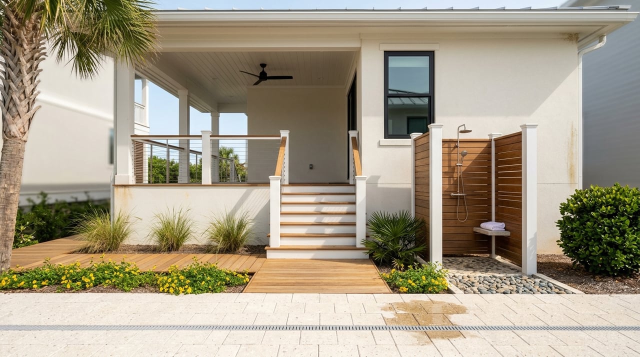
Lighting plays a crucial role in how paint colors are perceived. A color that looks perfect in a showroom or on a paint swatch may appear entirely different depending on the direction the room faces, the time of day, and the quality of natural light. In coastal homes like those in Ponte Vedra Beach, natural light often plays a central role in interior design.
Rooms that face north typically receive cooler, indirect light, which can make colors appear slightly muted or blue-toned. In these spaces, warmer colors can help balance the cool light. South-facing rooms, on the other hand, receive abundant natural light throughout the day, which enhances most colors and allows for deeper, richer tones without overwhelming the space. East-facing rooms are ideal for soft, warm tones that catch the morning light, while west-facing spaces often benefit from cooler hues to balance the intensity of the late-day sun.
Homeowners should always test samples in each room, observing them at different times to ensure the tone aligns with the intended mood and function.
Choosing Tones for Open Floor Plans
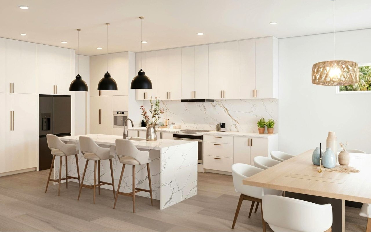
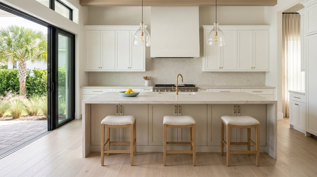
In open-concept homes, selecting paint colors requires a cohesive strategy. These floor plans often flow from one space to another without clear dividing walls, so colors must work in harmony while still defining each area’s purpose. A common technique is to use a neutral base—such as a warm white, greige, or soft taupe—throughout the primary living areas and introduce accent walls or subtle variations in shade to differentiate zones like the dining space or reading nook.
Accent colors can be pulled from furnishings, rugs, or artwork to maintain continuity. This layered approach keeps the home feeling elegant and intentional, which is especially important in upscale properties where architectural features and interior finishes are often the focal point.
Setting the Tone in Private Spaces
Bedrooms, bathrooms, and home offices allow for more personalized color decisions. These spaces are typically designed for relaxation or focused activity, so the emotional impact of color becomes even more important. In master bedrooms, muted blues, soft grays, or pale lavenders create a serene environment conducive to rest. In children’s bedrooms, lighter versions of playful tones like coral, mint, or sunshine yellow can support creativity without overstimulation.
Bathrooms, especially in luxury homes, often serve as spa-like retreats. Here, soothing colors like seafoam, pearl gray, or sandy beige reflect a sense of calm and cleanliness. These tones also pair well with high-end materials such as marble, quartz, and brushed brass.
In home offices, neutral and earth-toned palettes are especially effective. Shades like warm charcoal, olive, or slate can ground the space and support focus, while still offering a refined aesthetic.
Accent Walls and Statement Colors
For homeowners who want to introduce bold color without overwhelming a space, accent walls provide an ideal solution. A single wall in a dramatic shade—such as navy, deep emerald, or rich clay—can add visual interest and a sense of depth. Accent walls work particularly well in living rooms, dining areas, or behind a bed in the primary suite.
Statement colors can also be introduced through cabinetry, interior doors, or built-in shelving. When used strategically, these colors can elevate the luxury feel of a home and reflect the personality of its owner without dominating the overall palette. The key is balance—bold tones should complement, not compete with, the surrounding design elements.
Creating a Timeless Palette
While trend-driven colors may be appealing in the short term, timeless palettes tend to offer the greatest longevity and flexibility. Neutrals, soft earth tones, and nature-inspired hues provide a sophisticated backdrop that allows furnishings and artwork to take center stage. These palettes also support the resale value of a home, as they appeal to a broad range of potential buyers.
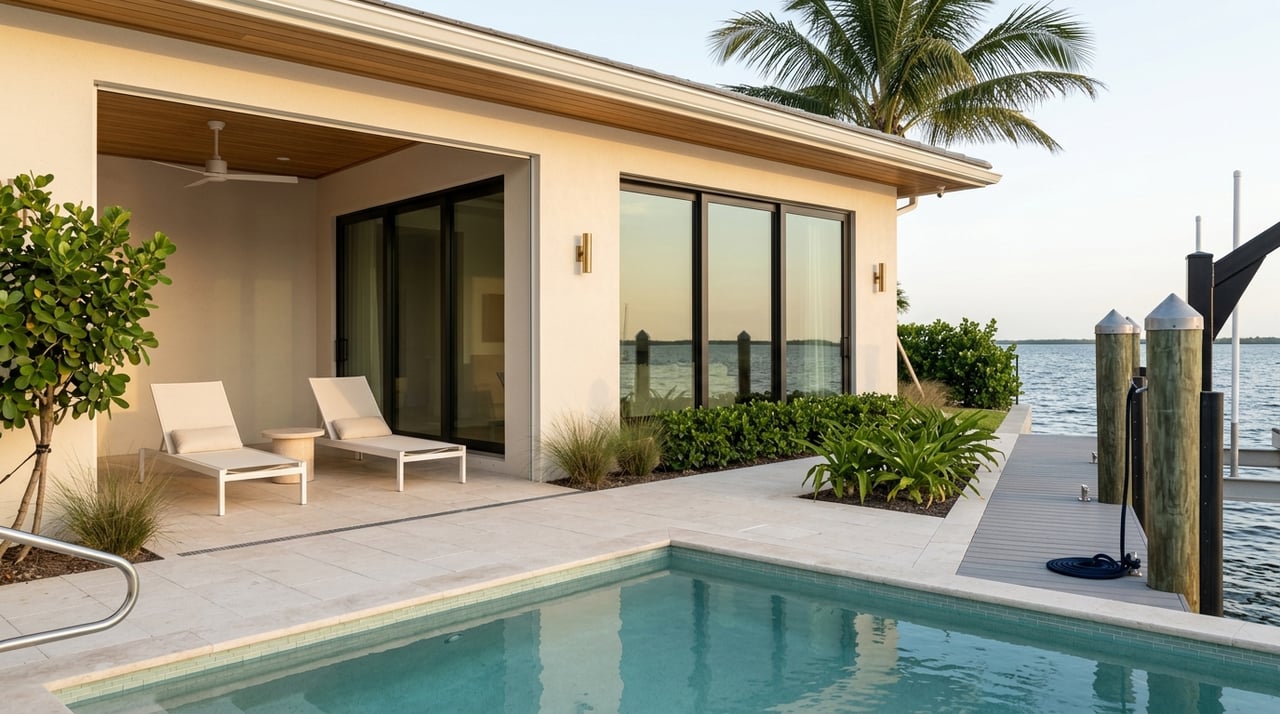
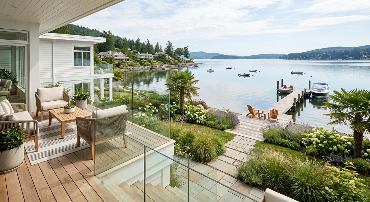
In Ponte Vedra Beach, coastal-inspired palettes remain popular for their light, airy feel. Shades of sand, driftwood, and sea glass work beautifully in homes with ocean views or open layouts, enhancing the connection between indoor and outdoor spaces. These tones not only reflect the surrounding environment but also provide a serene foundation for layered, elegant interiors.
Elevate Your Home With Expert Insight from Suzie & Rory Connolly
Selecting the right paint tones is a foundational step in creating a home that feels both luxurious and livable. For those buying or selling a home in Ponte Vedra Beach, the right color palette can make a meaningful difference in how a property is experienced. Whether you’re preparing to list your home or envisioning updates to a newly purchased space,
reach out to Suzie & Rory Connolly for expert guidance on Ponte Vedra Beach, FL homes for sale. Their local knowledge and design insight can help you make choices that reflect your lifestyle while maximizing your home’s visual and emotional appeal.